Disney+ Design System
A seemingly beautiful interface was hiding a fragmented one. Consistency was breaking at scale.
The audit surfaced a single root cause: nothing agreed. Fragmented typography, inconsistent color, mismatched components: small decisions made in isolation that accumulated into an interface that felt unpolished and, at its worst, inaccessible.
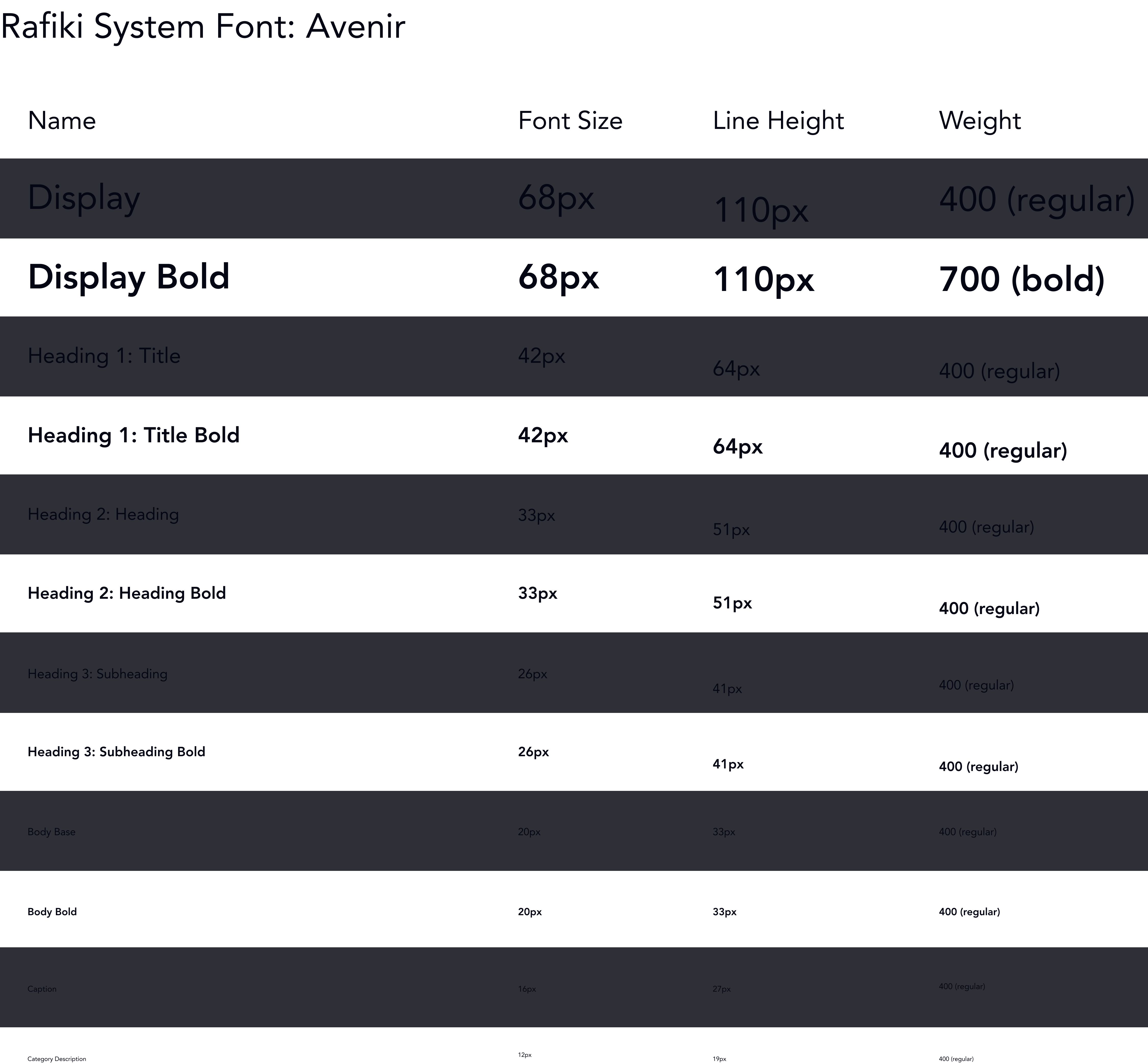
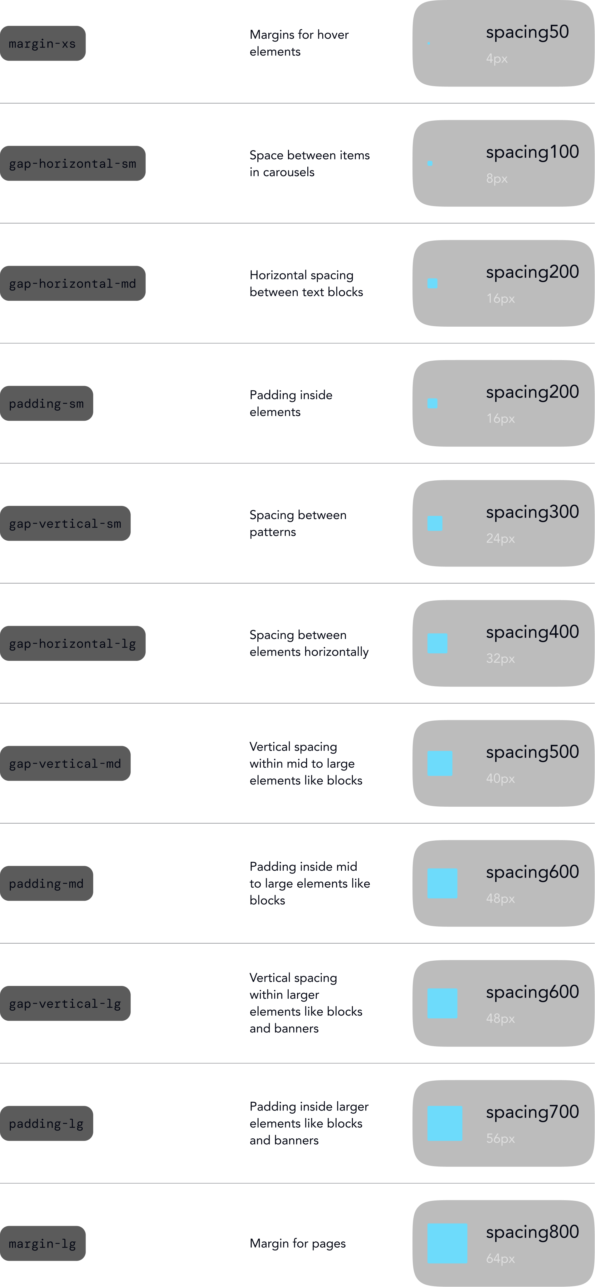
An unofficial design system for Disney+. The approach: tokens before components, with color, typography, and spacing locked in as variables first. The outcome: a foundation flexible enough that theming for a new franchise means remapping values, not starting over.
View the Rafiki UI Kit on Figma Community ↗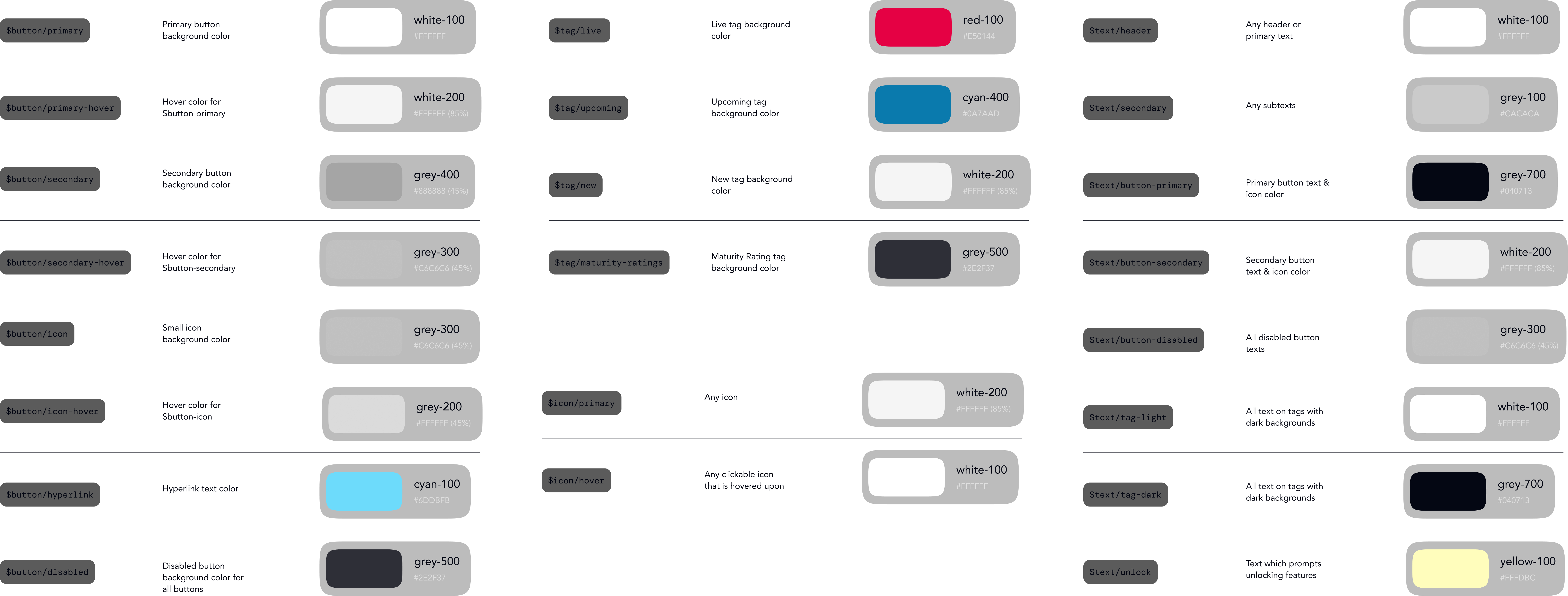
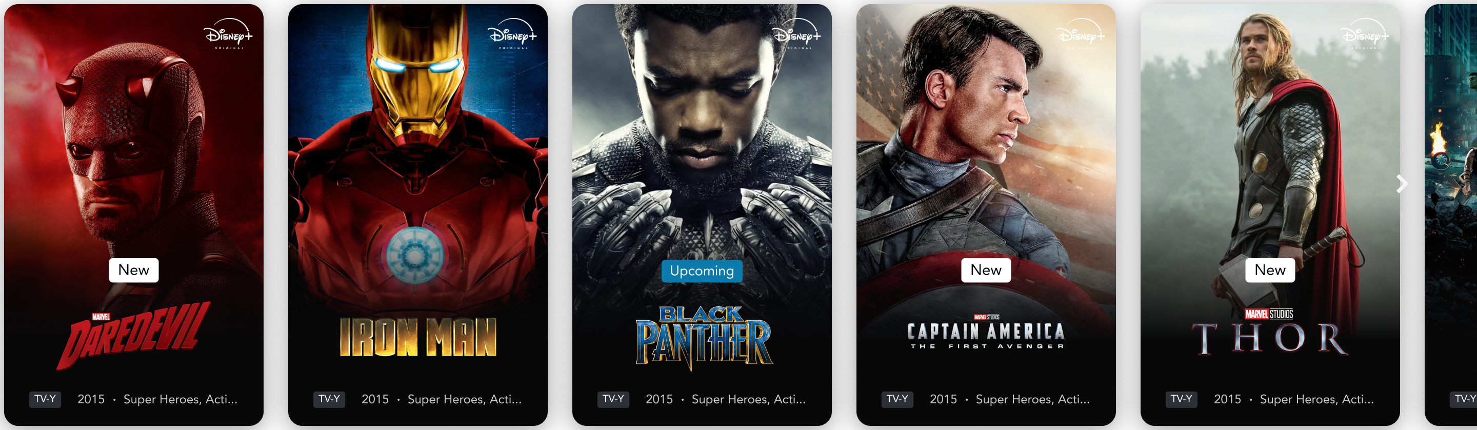
The media card shows what variable-driven components actually enable: swapping icons and toggling elements on and off, all without touching the underlying structure.
Components assembled into full patterns, the real test of whether the system holds.
Starting from the interface as it existed, not how it should have been, and building up from there.
Full interface inventory across multiple screens. Every button, card, navigation state, and icon cataloged and laid out in FigJam, making the fragmentation visible as a whole before trying to fix any of it.
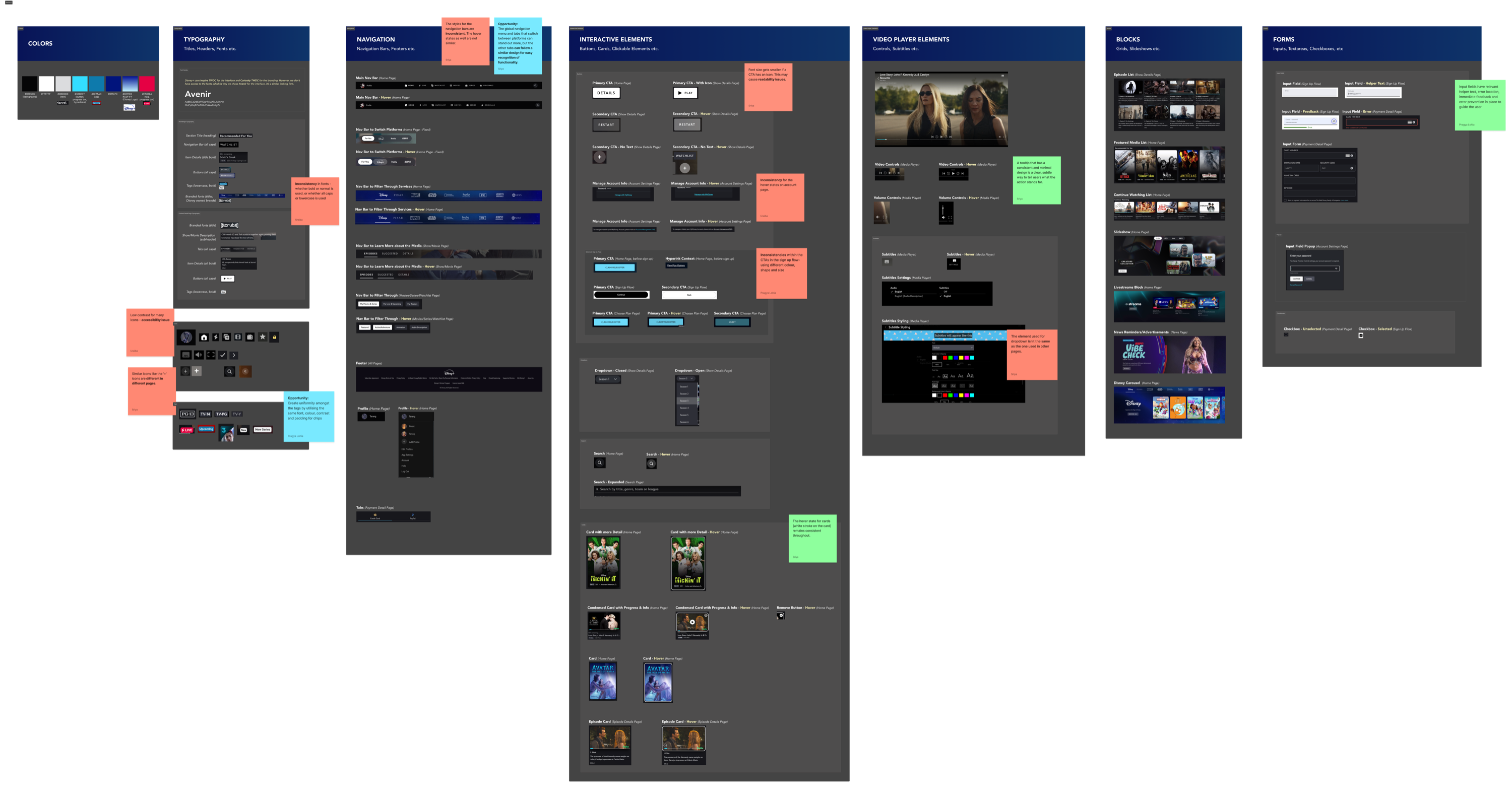
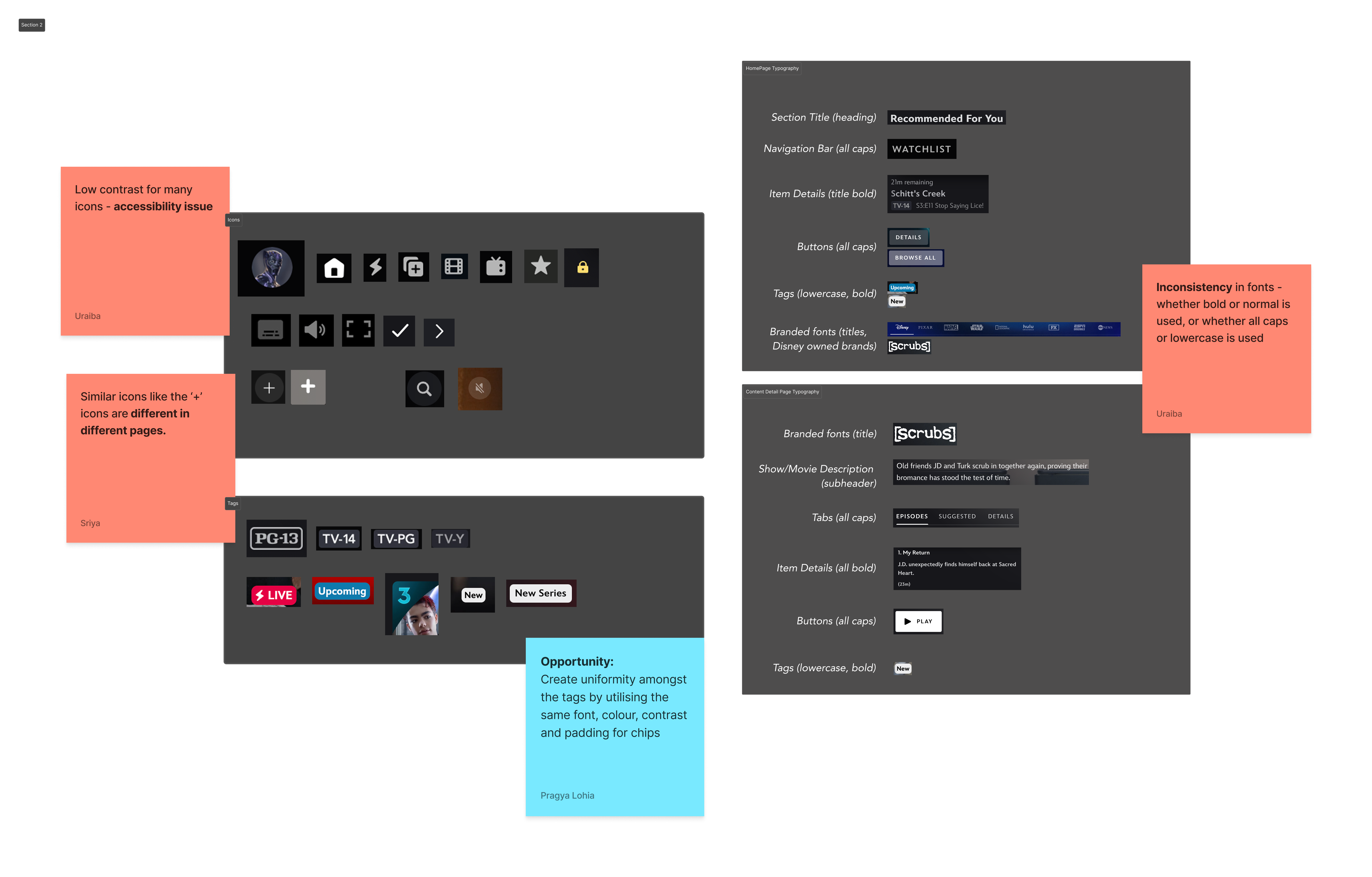
Seventeen shades of gray. Icon weights and colors that varied screen to screen. Font sizes, weights, and typefaces with no clear system behind them. Tags styled differently across every context. The inconsistencies weren't subtle. They were everywhere.
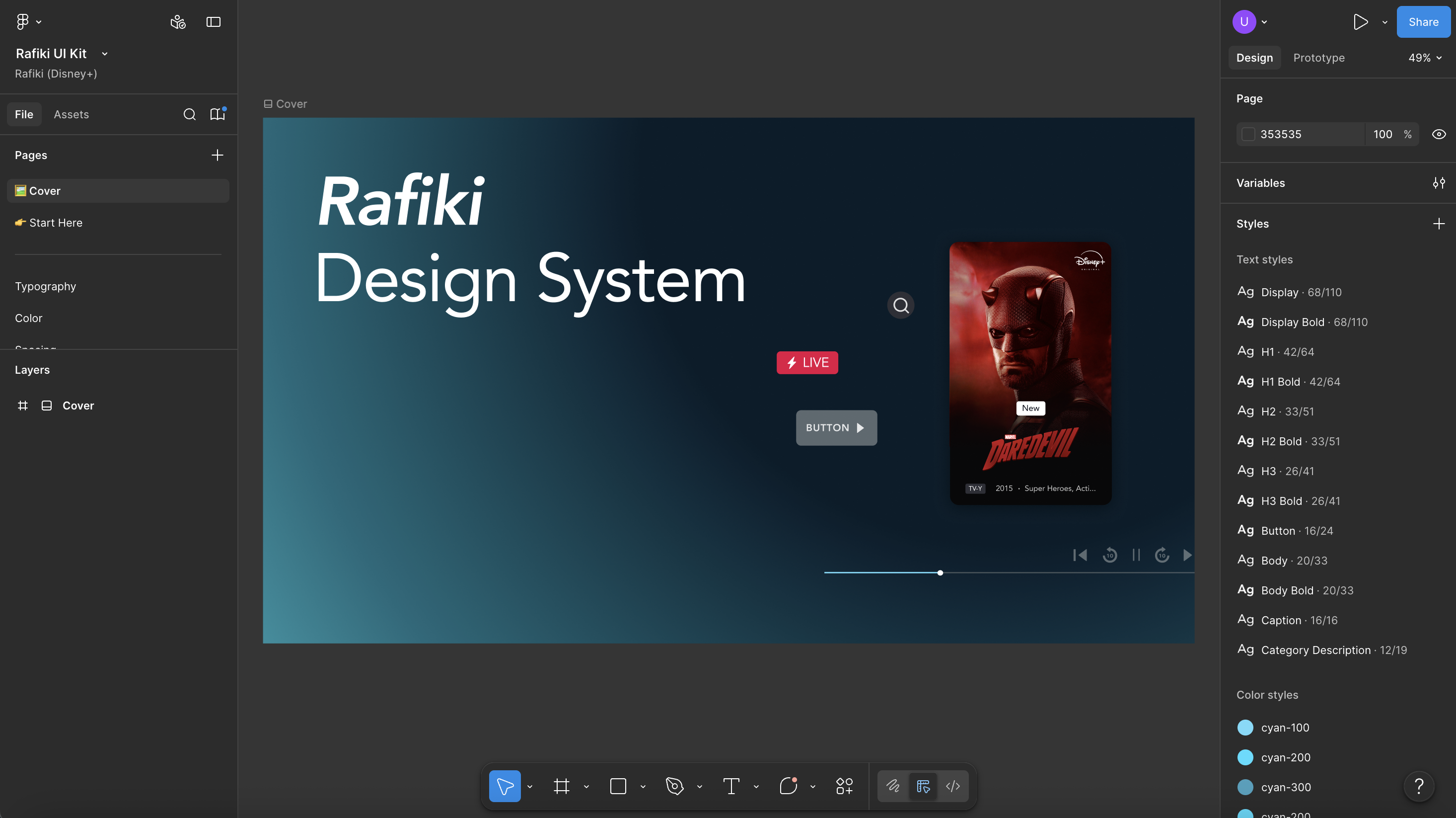
Token architecture before a single component. Color, typography, and spacing defined as Figma variables first, so every component built on top would inherit the system's decisions automatically.
A designer unfamiliar with Rafiki assembled full-page layouts using only the system. Gaps surfaced immediately, like inconsistent sizing when components were combined and missing icon states, and fed directly back into the build.
Every component annotated with usage guidelines in a live Zeroheight site, synced to Figma. Documentation that stays current as the system evolves, not a PDF that goes stale the week after it's written.
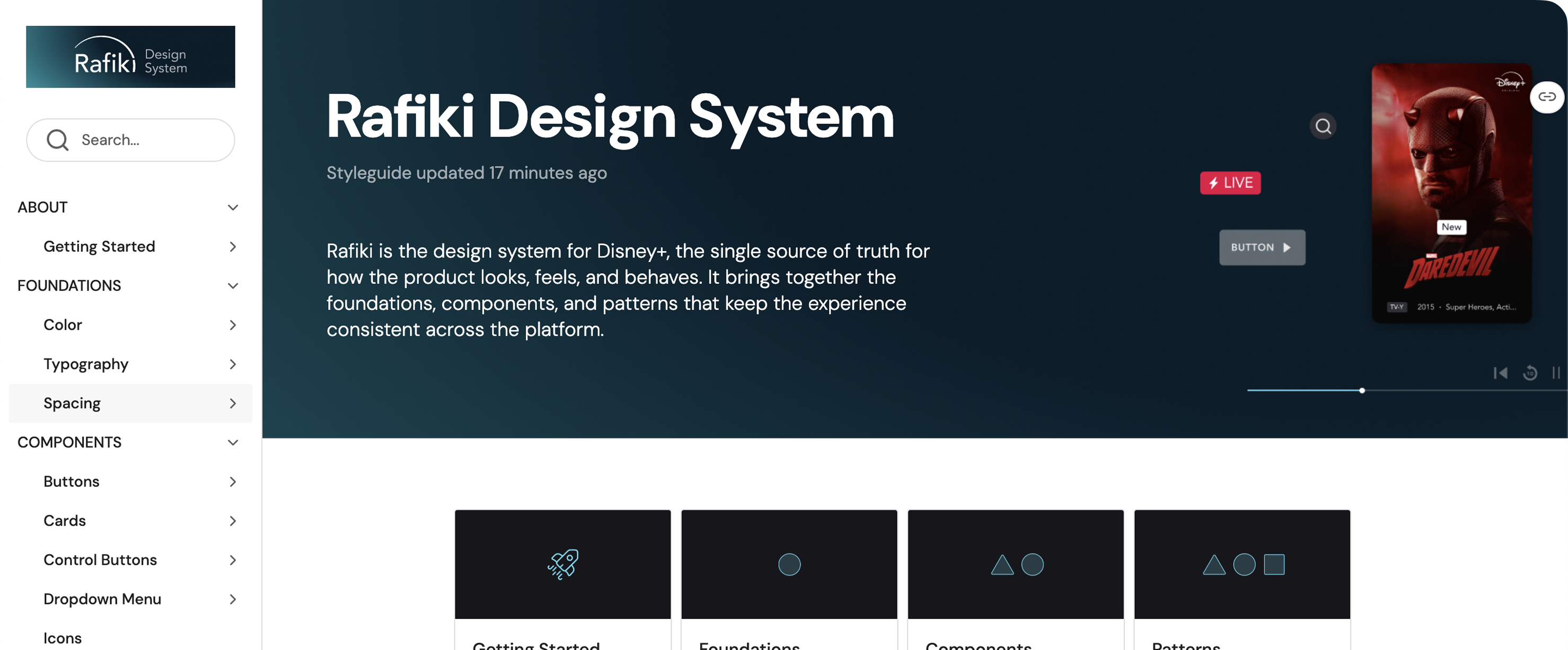
Rafiki was built for three: the designers maintaining it, the engineers implementing it, and the users who'd finally get a consistent interface.
- Full token architecture: color, typography, and spacing defined as Figma variables
- Foundations, components, and patterns built with auto-layout and variable-driven properties
- Franchise theming system: brand palettes remapped through tokens, not rebuilt from scratch
- Live Zeroheight documentation synced with Figma, annotated for design–engineering handoff
"Design systems are culture change disguised as a UI kit." — Lauren LoPrete
.png?v=3)